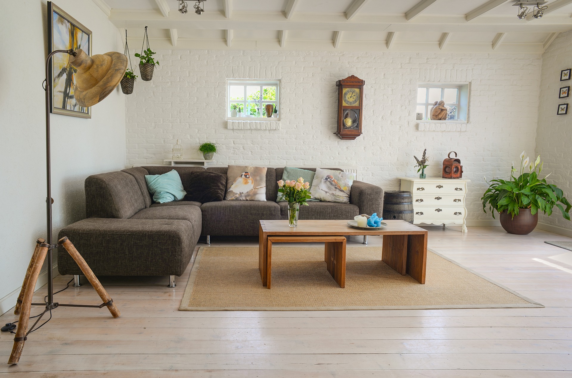
A whole-home color palette does not mean painting every room the same color. The goal is simpler: when you move from the entryway to the living room, kitchen, hallway, and bedrooms, the colors should feel related rather than accidental.
The easiest way to get there is to choose a small group of colors before you start buying decorative pieces. That gives you a framework for paint, upholstery, rugs, curtains, artwork, and smaller accents. It also makes future decorating easier because you can judge a new item against something you already know works.
This guide focuses on a practical method rather than a rigid formula. Your flooring, natural light, existing furniture, and personal taste should influence the final palette.
Start With What You Cannot Easily Change
Before choosing paint, photograph or list the finishes that are staying. Look at the flooring, kitchen cabinets and counters, bathroom tile, doors, large furniture, and other expensive elements you are not planning to replace.
Then identify their general color temperature. Warm woods, cream surfaces, beige stone, and many terracotta tones tend to read warm. Blue-grey stone, cool white finishes, charcoal, and some grey woods can read cooler. Some materials sit in the middle, so do not force them into a category if they are genuinely neutral.
Undertones matter more than the broad color name. Two paints can both be called white while one looks creamy and the other looks slightly blue. The same is true of grey, beige, green, and even black.
A useful test is to hold a paint or fabric sample beside the fixed finish in daylight. If the combination looks noticeably cleaner together than it does under artificial light, test it again in the evening before committing.
Practical rule: choose colors that cooperate with the largest fixed surfaces first. Do not choose a wall color in isolation and then try to make the rest of the room fit around it.
Choose an Anchor Neutral
Most connected homes benefit from one dependable neutral that appears in several rooms. It might be a warm white, soft beige, greige, pale taupe, or another color that works with your existing finishes.
The anchor does not have to cover every wall. It can appear in hallways, adjoining rooms, trim, cabinetry, upholstery, rugs, or other large surfaces. Repetition is what creates continuity.
Choose the anchor in the room where color is hardest to control. A dim hallway or north-facing room can make a neutral look very different from a bright room with strong afternoon sun. Test the candidate colors there first.
A Better Paint-Test Method
Do not judge a whole-home neutral from a tiny paint card. Instead:
- Test at least two or three close alternatives.
- Use large sample areas or large removable samples.
- Put samples on more than one wall where possible.
- Check them in morning, afternoon, and evening light.
- Compare them against your flooring and largest furniture pieces.
- Leave the samples in place for several days before deciding.
This process also reveals whether a color becomes too yellow, pink, blue, or grey in your particular lighting.
Use the 60-30-10 Rule as a Starting Point, Not a Law
The familiar 60-30-10 approach can be useful because it forces you to think about proportion. Roughly 60 percent of a room can be the dominant color, 30 percent a secondary color, and 10 percent an accent. But real rooms rarely divide themselves so neatly. Flooring, woodwork, upholstery, artwork, and natural materials make exact percentages impractical.
Instead, use the idea this way:
- Dominant: the color occupying the largest visual area, often walls, flooring, or large furniture.
- Secondary: a supporting color repeated across curtains, upholstery, rugs, cabinetry, or bedding.
- Accent: a smaller amount of a stronger or more distinctive color in cushions, artwork, ceramics, lamps, or other accessories.
For a whole home, keep the dominant neutral relatively stable while allowing the secondary and accent colors to change between rooms. That gives you consistency without making every room identical.

Build a Palette of Three to Five Main Colors
You do not need a long list of paint names. A useful starting palette can contain:
- One anchor neutral for continuity.
- One grounding color that provides depth.
- One or two supporting colors for furniture and textiles.
- One accent color used in smaller amounts.
For example, imagine a home with medium warm wood floors and cream kitchen cabinets. A possible palette could be:
- Warm white — anchor
- Soft sand — secondary neutral
- Deep olive — grounding color
- Muted terracotta — accent
The exact shades should still be tested against the home’s real finishes. The value of the example is the relationship between the colors, not the idea that these exact colors work in every house.
Once you have selected your palette, write down the paint names, codes, fabric colors, or sample references. Keep the record on your phone or in a small decorating folder. It becomes a shopping filter for everything you buy later.
Look at the Sightlines Between Rooms
Color continuity matters most where rooms can be seen together. Stand at the entrance to your home and look toward the spaces visible from there. Then repeat the exercise from the living room, dining area, and major hallway intersections. These views are your visual connections.
If the living room uses olive in its cushions and artwork, the dining area does not need to become olive green. It could repeat the same olive in a vase, chair fabric, or artwork while introducing a different secondary color. This creates a useful principle: repeat colors, but vary where and how they appear.
A bedroom at the end of a hallway can have more personality because it is visually separated. An open-plan kitchen and living room usually need a closer relationship because their large surfaces are visible at the same time.
Give Each Room a Job Within the Palette
Instead of assigning the same colors to every room, decide what role each room should play.
Living Room
Use the anchor neutral on the largest surfaces and let upholstery, rugs, artwork, and cushions carry the secondary and accent colors. This is often the room where you can establish the home’s overall palette most clearly.
Kitchen and Dining Area
Start with the cabinets, counters, backsplash, and flooring. Repeat one or two living-room colors in dining chairs, textiles, artwork, or small accessories rather than adding an unrelated new color.
Bedroom
Bedrooms can use a quieter version of the palette. Keep large pieces restrained and use bedding, curtains, and smaller textiles to introduce color. If the bedroom is not visible from the main living spaces, it can be the place where you use a deeper shade.
Bathroom
Let permanent tile and fixtures lead the decision. Towels, bath mats, artwork, and accessories are easy places to connect the bathroom to the rest of the home without forcing an exact wall-color match.
Coordinate Color With Materials, Not Just Paint
A palette can look flat if every item is the same type of color and finish. Color becomes more convincing when it is distributed across different materials. For example, a muted green might appear as painted cabinetry, a woven cushion, a plant container, and a small piece of artwork. The colors relate, but the materials prevent the room from looking like a color-matching exercise.
This is particularly helpful when you are decorating gradually. You can introduce the same color through inexpensive textiles or accessories before deciding whether it deserves a larger commitment such as a feature wall or upholstered chair.
Use Artwork to Connect Several Colors at Once
Artwork can solve a common decorating problem: you want to introduce several palette colors without buying separate accessories in every shade. Look for a piece that contains two or three colors already present in the room. For example, artwork with cream, olive, and muted rust can visually connect a neutral wall, green cushion, and terracotta accent.
Do not try to match every color exactly. A close tonal relationship usually looks more natural than a collection of objects that were purchased as an exact matching set.

A Worked Example: One Palette Across a Small Home
Imagine a three-bedroom home with warm wood flooring, cream kitchen cabinetry, a beige sofa, and black metal lighting. A practical palette might be:
- Anchor: warm off-white
- Secondary: soft beige/sand
- Grounding: charcoal or deep olive
- Accent: muted terracotta
The living room could use the off-white walls, beige sofa, olive cushions, and terracotta artwork. The dining area could keep the same wall color while using charcoal dining chairs and a small amount of olive in the artwork or table accessories. The main bedroom could use the off-white or a slightly deeper related neutral, with beige bedding and olive or charcoal accents.
A second bedroom could introduce more terracotta through a rug or bedding while keeping the larger surfaces neutral. Notice what is happening: the rooms are not copies of one another. The repeated colors are doing the connecting work.
Common Color-Palette Mistakes
Choosing Every Room Separately
A color can look excellent by itself and still create a disconnected home when placed next to unrelated colors. Check adjoining rooms and sightlines before finalizing strong colors.
Ignoring Existing Floors
Replacing a paint color is usually easier than replacing flooring. Let the floor participate in the palette instead of treating it as a background detail.
Testing Only in Daylight
A color that looks perfect at noon can look noticeably different under your evening lighting. Always test the room during the hours when you actually use it.
Buying Decor Before Choosing the Framework
A collection of individually attractive cushions, rugs, and accessories can still produce a scattered room. Establish the palette first, then shop within it.
Using Too Many Accent Colors
If every decorative item introduces another strong color, there is no clear hierarchy. When a room feels busy, remove a few competing accents before adding another color.
Treating 60-30-10 as an Exact Calculation
It is a visual planning tool, not a mathematical requirement. A room with patterned tile, wood furniture, and colorful artwork will naturally break the percentages.
Make a Simple Color Reference Before You Shop
Create one page with:
- Anchor neutral and paint code
- Secondary neutral
- Grounding color
- Accent color
- Flooring and cabinet reference photos
- Existing sofa and major furniture colors
- A note about the room’s natural light
Keep physical paint or fabric samples with the reference when possible. Swatch sticks can be particularly useful when you are comparing several related colors over time. When buying a new rug, curtain, cushion, lamp, or piece of artwork, compare it against the reference rather than relying on memory. This simple habit reduces impulse purchases that later have nowhere to go.
When You Want a Change, Change the Small Layer First
A cohesive palette should not make your home feel permanently locked into one look. Keep the expensive elements relatively stable and change the smaller layer when you want a refresh. Cushion covers, throws, artwork, vases, and other accessories are easier to replace than flooring, cabinets, or large upholstered furniture. A muted terracotta accent can move toward a dusty rose or ochre family over time while the anchor neutral and grounding color remain consistent.
That is one of the strongest reasons to plan the palette before decorating: you can update the mood without starting the entire room again.
Whole-Home Color Checklist
Before buying paint or committing to a new color, ask:
- What fixed finishes must this color work with?
- Are the important undertones warm, cool, or mixed?
- What is my anchor neutral?
- Which colors will repeat between visible rooms?
- Where will the grounding color appear?
- Which color is reserved for smaller accents?
- Have I checked the color in morning, afternoon, and evening light?
- Does the color work with my flooring and largest furniture?
- Can I name where the new color will appear before I buy it?
- If I remove one accent color, does the room become clearer?
Final Thought
A successful whole-home palette is less about finding five perfect colors and more about deciding how those colors will behave together. Start with the finishes you already own, establish an anchor neutral, choose a small supporting palette, and then repeat selected colors across the rooms that can see one another.
The result should not feel like every room came from the same catalog. It should feel like the same home, with each room allowed to have its own character. Disclosure: Glimerz may earn a commission from qualifying purchases made through affiliate links in this article. Product suggestions are included because they relate to the decorating methods discussed above.

