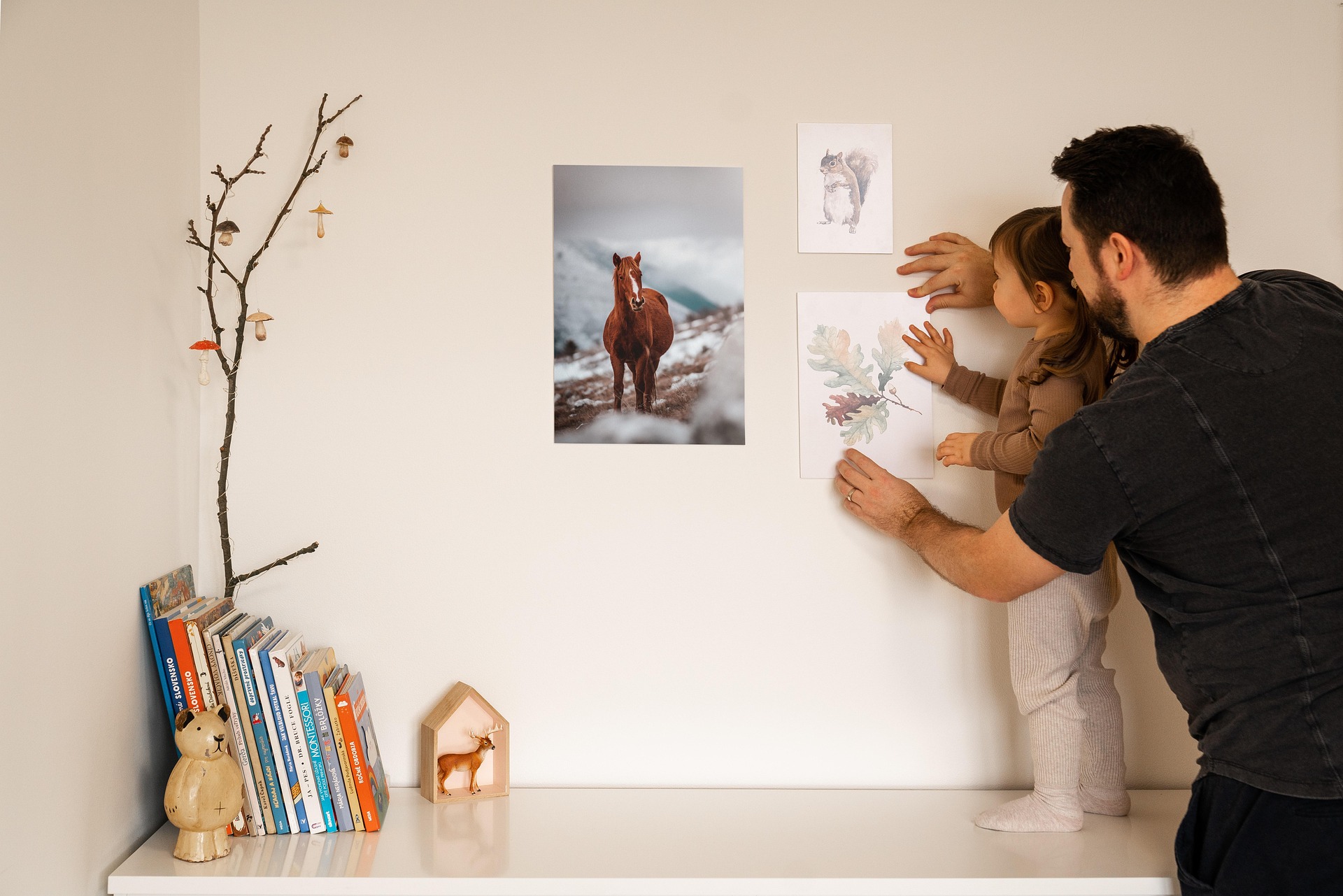
Wall art is one of the easiest ways to make a room feel personal, but it is also one of the easiest decorating purchases to get wrong. A beautiful print can still look awkward if it is too small for the furniture below it, hung too high, or surrounded by inconsistent gaps. The good news is that you do not need an interior-design degree to get the proportions right. A tape measure, a few pieces of painter’s tape, and a little planning can eliminate most of the guesswork.
This guide focuses on the practical decisions: how wide the art should be, where its center should sit, how much space to leave between pieces, and when a single work is better than a gallery wall.
Start With the Furniture, Not the Empty Wall
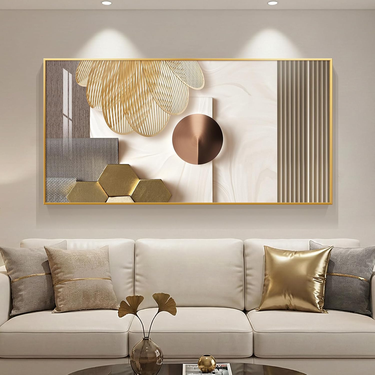
When artwork hangs above a sofa, bed, console, sideboard, or dining cabinet, that furniture becomes the visual anchor. Measure its usable width first. For a single piece or a tightly grouped arrangement, a useful starting point is about 60–75% of the furniture’s width. This is a guideline rather than a law, but it is a reliable way to avoid artwork that looks undersized.
For example, if your sofa is 84 inches wide:
- 60% = about 50 inches
- 70% = about 59 inches
- 75% = about 63 inches
That means an artwork arrangement roughly 50–63 inches wide is a sensible range to test. The total width includes the space occupied by multiple frames if you are creating a gallery wall. Do not automatically use the full width of the wall. The wall may be much wider than the furniture, and filling it simply because there is empty space can make the composition feel disconnected.
The 6–10 Inch Furniture Gap
One of the most common wall-art mistakes is leaving a large empty area between the furniture and the artwork. For art hung above furniture, start by testing a gap of roughly 6–10 inches between the top of the furniture and the bottom of the frame. The exact distance depends on the furniture height, artwork size, and the room’s proportions.
A low console may need a little more breathing room than a tall headboard. A very large artwork may also need to sit slightly closer to its anchor so the complete arrangement reads as one unit. The important point is visual connection: the art should feel related to the furniture beneath it rather than floating independently on the wall.
Where Should the Center of the Art Be?
For artwork that is not tied to furniture, placing the center of the artwork around 57–60 inches from the floor is a useful starting point for many homes. Adjust it for the people who actually use the room and for unusually high or low ceilings. Above furniture, do not force the 57–60 inch rule if doing so creates an excessive gap below the frame. The relationship between the art and its furniture anchor usually matters more than following a single number.
Before drilling, use painter’s tape to mark the proposed top and bottom edges. Stand several feet away and view the arrangement from the normal position where you enter or use the room.
Artwork Above a Sofa
A sofa wall is usually wide, so horizontal artwork works naturally, but it is not your only option.
Option 1: One large piece
Choose one substantial horizontal work when you want a calm, simple focal point. Aim for a total width around 60–75% of the sofa width as a starting range.
Option 2: Three coordinated pieces
Three smaller works can create a wider composition without requiring one large expensive piece. Keep the visual weight reasonably balanced and maintain consistent gaps.
Option 3: A gallery wall
A gallery wall is useful when you have several pieces with personal meaning or when a collection works better than one oversized image. Treat the entire collection as one shape and measure its outside edges before hanging anything. The mistake is measuring each frame separately and forgetting that the group needs to relate to the sofa as a whole.
Artwork Above a Bed
Bedrooms often have a wider horizontal anchor than people realize because the headboard or bed itself establishes the visual width. For a queen bed, for example, a group that is approximately 60–75% of the bed width can be a useful starting point. A single horizontal artwork, a pair of balanced pieces, or a compact gallery wall can all work.
Keep the lowest artwork edge comfortably above the headboard. If the headboard is tall, the available wall space may be limited, so a shorter horizontal composition can work better than a tall frame. Avoid hanging heavy objects where they could create a safety concern. Use appropriate hardware for the wall type and the weight of the frame.

Artwork Above a Console or Sideboard
Console tables are narrower than sofas, which means oversized artwork can quickly overwhelm them. Start by measuring the console width and apply the same 60–75% guideline. If the console is 48 inches wide, a roughly 29–36 inch-wide artwork arrangement is a reasonable range to test.
A round mirror can also work particularly well above a rectangular console because the curved shape adds contrast. The mirror does not have to be the same width as the console; the goal is to create a balanced relationship between the two. Leave enough tabletop space for the accessories you actually use. If the artwork and console styling together become crowded, reduce the number of objects rather than pushing everything to the edges.
Gallery Wall Spacing: Make the Gaps Deliberate
Gallery walls look intentional when the spacing is consistent. A practical starting point is 2–3 inches between frames. Larger pieces may tolerate slightly larger gaps, while small frames can look disconnected if the spaces become too wide.
Before hanging:
- Measure every frame, including its actual outside dimensions.
- Arrange the pieces on the floor.
- Photograph the arrangement from above.
- Adjust the gaps until the group feels balanced.
- Transfer the layout to the wall with paper templates or painter’s tape.
- Mark the hanging points only after the complete arrangement is approved.
Do not assume every frame needs to line up perfectly. A gallery wall can be symmetrical, grid-like, or intentionally irregular. Consistent relationships matter more than forcing every outside edge into a straight line.
Three Simple Gallery Wall Layouts
The Grid
Use equal-sized or similarly proportioned frames in rows and columns. This is the easiest layout to plan and works especially well when you want a clean, orderly look.
The Centered Cluster
Start with one central piece and build outward with smaller works. Keep the outer boundary of the complete arrangement reasonably balanced.
The Vertical Column
Use a taller arrangement for narrow walls, stair landings, or spaces beside tall furniture. The composition should follow the vertical shape of the available wall rather than being forced into a wide rectangle. For any layout, make the complete group the unit you measure—not each frame individually.
How to Choose Between Art and a Mirror
Art and mirrors solve different decorating problems, even though both occupy wall space. Choose artwork when you want to introduce color, personality, subject matter, or a connection to a particular interest. Choose a mirror when reflection, brightness, or the perception of additional visual depth is more useful.
A mirror should also be positioned deliberately. Reflecting a blank wall, an attractive window view, a light source, or an important architectural feature can be more useful than simply putting a mirror wherever there is an empty wall. Avoid placing a mirror where it creates an unwanted reflection of clutter or a television if that will bother you in everyday use.
Do Not Forget the Wall Itself
Wall size and ceiling height still matter even when furniture provides the main measurement. On a tall, narrow wall, a vertical artwork or stacked arrangement can use the available height more naturally. On a wide, low wall, a horizontal piece or wider gallery arrangement usually relates more easily to the proportions.
For a completely empty wall with no furniture underneath, look at the wall as a rectangle. A small print placed alone in the center of a very large wall can look lost. In that situation, consider a larger piece, a pair, a gallery arrangement, or a piece of furniture that can visually anchor the artwork.
Lighting Can Make Good Art Look Better
Artwork should be visible under the lighting conditions you actually use. Before adding a picture light, check where existing lamps and ceiling lights create glare or shadows. A dedicated picture light can be useful for a dark wall or a display you want to emphasize. Choose a fixture appropriate for the artwork’s size and install it according to the manufacturer’s guidance.
For valuable original artwork, photographs, or materials that can be damaged by heat or prolonged light exposure, follow the care guidance for the specific work rather than treating every picture-light setup as interchangeable.
A Worked Example: An 84-Inch Sofa Wall
Imagine an 84-inch sofa with a blank wall behind it. First, calculate the starting artwork range:
- 84 × 0.60 = 50.4 inches
- 84 × 0.75 = 63 inches
So you might test an arrangement between about 50 and 63 inches wide. If you choose three frames that are each 18 inches wide and leave 3-inch gaps, the total width is: 18 + 3 + 18 + 3 + 18 = 60 inches. That fits neatly within the starting range. You could then test the group approximately 6–10 inches above the sofa, using painter’s tape first.
This simple calculation is more useful than buying three frames because they “look about right” online and hoping the scale works once they arrive.
Common Wall-Art Mistakes
Buying by frame size alone
A frame can look large online and surprisingly small on a large wall. Measure the wall and furniture before buying.
Measuring each gallery-wall frame but not the group
The collection needs a complete width and height. Treat it as one composition.
Hanging art too high
If the artwork feels disconnected from the sofa, console, or bed, test a lower position before buying different art.
Making every gap different
Irregular spacing can look accidental. Decide on a spacing range and repeat it.
Ignoring the frame
The frame is part of the artwork’s total visual weight. Include its outside dimensions when measuring.
Forgetting viewing angles
Art should look right from the places where people actually sit, stand, and enter the room—not only from directly underneath it.
Choosing art only because it matches the wall color
A room can become flat when every piece simply repeats the paint color. Consider contrast, existing furniture, textiles, and the overall palette instead.
A Five-Minute Wall-Art Planning Checklist
Before you purchase or drill, write down:
- Furniture width: ______
- Available wall width: ______
- Available wall height: ______
- Target artwork width: approximately 60–75% of furniture width
- Planned furniture-to-art gap: approximately 6–10 inches
- Gallery-wall gap: approximately 2–3 inches
- Frame outside dimensions: ______
- Total gallery arrangement width: ______
- Total gallery arrangement height: ______
- Wall type and appropriate hanging hardware: ______
- Lighting conditions: ______
- Normal viewing position: ______
Then tape the proposed outline on the wall and live with it for a few minutes before making holes. That small planning step can prevent an expensive mistake.
Final Thought: Proportion First, Personal Taste Second
There is no single “correct” piece of wall art. A family photograph, vintage poster, abstract painting, textile, mirror, or handmade object can all work when the scale and placement make sense for the room.
The most useful approach is to separate the decisions. First solve the physical problem—size, height, spacing, hardware, and lighting. Then choose the artwork you genuinely enjoy. When the proportions are right, you have much more freedom with style. Instead of buying art and trying to make the room accommodate it, measure the space first and choose something that belongs there.
Affiliate disclosure: Some product links in this article are affiliate links. If you purchase through them, Glimerz may earn a commission at no additional cost to you.

